About Content Blocks for Landing Pages
Learn how to use Mailchimp's various types of content blocks in your campaign design.

Get the job done with a pro
From training to full-service marketing, our community of partners can help you make things happen.
Mailchimp’s templates for email and landing pages are divided into sections, such as the body and footer. Sections help organize your content and guide your design. When you set fonts, colors, and other styles for a section, your changes will apply to all content blocks in that section.
In this article, you'll learn how to access and edit design settings for each section of your emails and landing pages.
Here are some things to know.
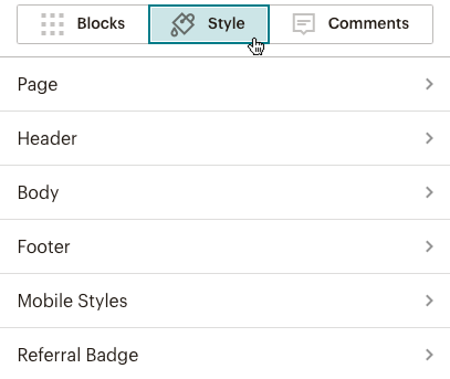
To view and edit section styles in your email in the new builder, follow these steps.
To view and edit section styles in your email or landing page in the legacy builder, follow these steps.
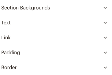
When you access design options for a section, you’ll find a number of different sections to customize. These usually include background colors, font sizes, and link styling. Some sections have additional options, such as borders and padding.
Note
Landing pages aren't subject to the same design limitations as email, so you may come across additional elements in landing page templates. These include background transparency options and a special element called an Interior Style that lets you layer 2 backgrounds on top of each other to highlight the content in a section.
Use this table to find the most common design options for each section and check whether they’re available for the new builder, legacy builder, and landing pages.
| Section | What it is | Common design options | New builder | Legacy builder | Landing pages |
|---|---|---|---|---|---|
| Page | The area behind the content in your email or landing page. | Background colors, images, borders, and padding. Font color and style for headings 1-4. |  Use Styles for page style | | |
| Preheader | The area at the very top of your email that usually includes text about the content and a link to the campaign page. Many email clients show the preheader text after the preview text and subject line in their inbox. | Background colors, images, borders, and padding. Font color and style for text and link. | The preheader is included with the header section | |  |
| Header | The image and text at the top of the email or landing page. This is typically the first thing recipients or page visitors see. | Background colors, images, borders, and padding for container and interior. Font color and style for text and link. | | | |
| Body | The main section of your email or landing page. | Background colors, images, borders, and padding for container and interior. Font color and style for text and link. | | | |
| Columns | Multi-column layouts. | Background colors, images, borders, and padding for column style. Font color and style for text and link. | | | |
| Details | Some templates include a details section. | Background color, top and bottom borders, top and bottom padding for container and interior. Interior style also has box shadow options. Font options for text. | | | |
| Footer | The content at the bottom of your email or landing page. This section is often used to contain trademarks and other fine print. | Background colors, images, borders, and padding. Font color and style for text and link. | | | |
| Mobile styles | Styles that display when your email or landing page appears on mobile devices. | Font size and line height for headings 1-4, and for boxed, header, body, and footer text. | Use Styles for mobile style options | | |
| Notification bar | Horizontal bar at the bottom of your website or landing page. Display messages such as a limited time offer or info about cookies. | Background color and text options. | | | |
| Referral badge | Located at the bottom of your email. Earn bill credits when you refer new paying customers to Mailchimp through the badge. | Choose between 2 Mailchimp logo styles. | | | |
| Mailchimp badge | Located at the bottom of your landing page. Includes the Mailchimp logo and a link for reporting abuse. This badge is required if you have a Free plan. | Choose between 2 Mailchimp logo styles. | | | |
Technical Support
Have a question?
Paid users can log in to access email and chat support.
Learn how to use Mailchimp's various types of content blocks in your campaign design.
Learn how to create a regular email in Mailchimp.