
Get the job done with a pro
From training to full-service marketing, our community of partners can help you make things happen.
Design Your Popup Form
After you select a template and create your Mailchimp popup form, design and customize the form to match your brand. Upload a logo, change fonts and colors, add follow-up steps and other eye-catching elements to engage your audience.
In this article, you’ll learn how to design your popup form.
Before you start
Here are some things to know before you begin this process.
- Mailchimp popup forms require a template. To learn more, check out Create a Popup Form.
- Your popup form design must comply with GDPR requirements. To learn more, check out Collect Consent With Popup Forms.
Design your form
After you create a popup form and choose a template, design it in the popup form editor to match your brand and maximize website engagement. Your form has different elements or components such as text, images, buttons, and input fields that can be changed separately. Your popup forms are listed on your Overview page.
Here's an overview of design elements you can add or change.
Add a logo
If you have a logo in your Mailchimp brand kit, the logo will be automatically inserted into your design. You can manually add a logo at any time.
To add your logo to your popup form, follow these steps.
- In the Steps panel, click Offer.
- Click Set Logo then choose Upload image or Browse images.
- Choose Upload image to select an image from your file picker. SVG, PNG, WebP, or AVIF files are supported.
- Choose Browse images to select an image from Content Studio.
- Change the logo style, adjust the position, width, height, and margin. You can add rounded corners and other elements to suit your design needs.
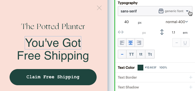
Update fonts
Update your popup form fonts using the bulk edit tool, or individually.
Bulk edit
To update your fonts with a bulk edit, follow these steps.
- In the Typography section, choose the font you want to update.
- In the Bulk edit all instances of this font popup, choose a font from the Font drop-down.
- To preview your changes, click Preview, then click Preview locally.
- When you’re ready to save your changes, click Save and review.

- Choose a font weight from the Weight drop-down, then click Update all uses of this font.
Individual edit
To update your fonts individually, follow these steps.
- In your popup form layout, click the text block you want to update.
- In the Typography section, click the drop-down and choose your font.
- Change the color, border, spacing, opacity, rotation, animation, and more.
- To preview your changes, click Preview, then click Preview locally.
- When you’re ready to save your changes, click Save and review.
Change colors
Modify your popup form’s colors for text, backgrounds, buttons, and borders.
To change your colors, follow these steps.
- In the Colors section, click the color you want to update. If you’re in your popup form layout, click Back to all Steps.
- Use the color picker to choose a preset or input a custom HEX code.
- To preview your changes, click Preview, then click Preview locally.
- When you’re ready to save your changes, click Save and review.

Repeat this process for all of the colors you want to change.
Add images
Images are a powerful way to make your Mailchimp popup forms more visually appealing. Replace or add new images to match your style and brand. For best results, we recommend an image size of 300KB.
To add or update images, follow these steps.
Image
- In the Steps panel, click Offer.
- Click Add an element.
- Drag and drop the Image element into your layout.
- In the Image section, click Upload.
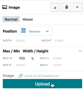
- Customize the image to match your website branding.
- If you no longer want the image, click delete on your keyboard.
Image background
- In your layout, click the image background you want to work with.
- In the Image Background section, click Replace Image. You can also Remove Background + Auto Crop or Remove Background only.
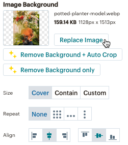
- Adjust the size, set a repeat pattern, or choose the alignment as needed.
- If you no longer want the image, click delete on your keyboard.
Add fields
The fields you can choose for popup forms include Email Input, Name, First Name, Last Name, Phone Number Birthday, and Text Input. Use the Text Input field to add other fields like address, zip code, and URL. Make sure you create a new field in your Audience fields and merge tags settings to configure your popup form.
Update text
It is recommended that you update text using the mobile view. The text will automatically update on the desktop.
To update your popup form text, follow these steps.
- In your popup form layout, double click the text you want to update.
- Enter your new text in the text block.
- Be sure to update your text across all steps of the popup form layout.
Update buttons
You can update the appearance and button actions in your layout.
To update buttons, follow these steps.
- In your layout, click the button you want to work with.
- In the Properties panel, click Appearance to update how your button looks.
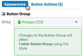
- Click Button Actions to see or add actions. For example, you could have button actions to collect email and SMS data from website visitors.
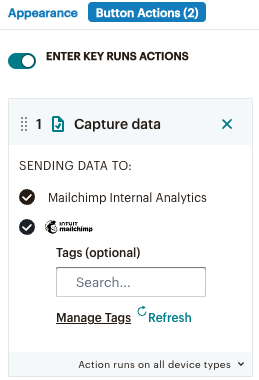
- In the Go to step section, click the Step dropdown to see other button actions, or click Add Action to add actions to suit your needs.

Update styles
Styles are applied to Mailchimp popup form templates to help you design your form. Add or remove styles in your layout to match your personal brand.
Edit styles
To edit styles, follow these steps.
- In the Layers panel, click the element with the style you want to change. The teardrop icon indicates a style is applied.
- In the Properties panel, click the STYLE drop-down to see all elements with that style.
- Choose the property (font, color, size, opacity, etc) you want to update. All elements in your layout with that style will be updated.
Create styles
To create a new style, follow these steps.
- Select the element without a style attached.
- In the Properties panel, click the New style icon.

- Name your style, then click Create Element Style.
- In the STYLE dropdown, click Detach style to remove a style.
Add discount code
Add a static or unique discount code to your popup form.
Static code
To add a static discount code, follow these steps.
- In the Steps panel, click Offer.
- Click Add an element.
- Drag and drop the Discount Code element into your layout.
- In the Discount Code Type section, select Static code.
- Enter the Discount name and adjust the style settings as needed.
Unique code
Unique discount codes require a connected Shopify store.
To add a unique discount code, follow these steps.
- In the Steps panel, click Offer.
- Click Add an element.
- Drag and drop the Discount Code element into your layout. For unique codes, this element must be placed after all email or SMS collection steps in your layout.
- In the Discount Code Type section, select Unique code.
- Click Add Unique Discount.
- If prompted, select or add a connected Shopify store and click Next.
- To use an existing discount, choose the Select unique discount option and use the drop-down to select a discount.
- To create a new discount, choose Create new unique discount and set the rules of your discount.
- Click Continue and adjust the style settings as needed.
Check out Manage Discount Codes to learn more about setting discount rules and managing discounts.
Update SMS legal links
If you choose a popup form template that includes SMS, add links to your SMS marketing terms and conditions and privacy policy.
To update your SMS legal links, follow these steps.
- In your layout on the Finish Signing Up step, click the Terms & Privacy links.
- Click Button Actions(1).
- Enter the URL(s) for your SMS legal links.
Note
Popup Forms doesn't support helper text. You can add a description using the text element, then drag & drop into your design layout.
Mini-quiz
Mini quizzes are an interactive way to engage website visitors and collect valuable data. Design a mini quiz with checkboxes, drop-downs, or radio buttons. For questions with 1 answer, use radio buttons or drop-downs. For questions with more than 1 answer, use checkboxes. For more information on mini quizzes, check out Add a Mini Quiz to Your Pop-up Form.
Radio buttons
Radio buttons, or a Radio Set, offer a visible multiple-choice design for your mini quiz. Your website visitors choose a single answer from the options you create.
To add radio buttons, follow these steps.
- In the mobile view port, click your design layout.
- Click +Add an element.
- Drag and drop the Radio Set element into your layout.
- In the Properties panel, click the Name drop-down to select a value for your radio set.
This maps to a group in your audience. - Click each radio button in the Radio Set container to assign values for each.
- Click the Use value as text slider to have the text value auto-populate in your layout.
- If you want the button to be pre-selected, turn the Pre-selected slider on.
- You can add spacing, change your fonts, and other design elements to customize your radio set to match your website branding.
Drop-down
Drop-downs offer a hidden multiple-choice design for your mini quiz. Your website visitors choose a single answer from the options you create.
To add a drop-down, follow these steps.
- In the mobile view port, click your design layout.
- Click +Add an element.
- Drag and drop the Dropdown element into your layout.
- Enter your drop-down field options. Make sure the drop-down has a unique value assigned.
- Click the REQUIRED slider to choose whether you want the field to be required.
- Use the design elements to customize your Drop-down to match your website branding and style.
Checkboxes
Checkboxes offer a multiple-answer and an individual answer option for your mini quiz. Your website visitors choose as many answers as they'd like from the options you create, or they can check a required checkbox. Use checkboxes to gather marketing permission or preferences as well as legal consent. We recommend starting with the checkbox template in the Newsletter template library for easy setup.
To add checkboxes, follow these steps.
- In the mobile view port, click your design layout.
- Click +Add an element.
- Drag and drop the Checkbox Set element into your layout.
- In the Properties panel, click the Name drop-down to assign your Checkbox Set to a group.
This maps to a group in your audience. - Click each checkbox option in the Checkbox Set container, then assign a value for when the checkbox is clicked.
- Click the Use value as text slider to have the text value auto-populate in your layout, or you can manually type the text.
- If you want the button to be checked by default, turn the Checked by default slider on.
- You can add spacing, change your fonts, and other design elements to customize your checkbox set to match your website branding.
You can add checkboxes. Right-click on the checkbox in your layout. In the popup menu, select Copy, then select Paste. Update as needed.
Add follow-up steps
Add follow-up steps to your popup form to help visitors re-engage with your form. Remind them of a discount offer or use buttons to transition them through the popup form.
Here are some follow-up steps you can add to your popup form.
Second-chance elements
Second-chance elements, also known as teasers, help re-engage visitors who previously dismissed your popup form. These teaser bubbles typically appear in the corner of the screen, and they follow visitors throughout their time on your website.
To add a second-chance element, follow these steps.
- In the Steps panel, click Follow-up.
- Click 2nd Chance Container.
- Choose your style settings for the follow-up step, text, and buttons.
- To remove a second-chance element, zoom out and click End Campaign.
Reminder bar
The Reminder bar acts as a prompt to encourage subscribed contacts to use their discount code after the popup form closes and they've opted in to your marketing. This bar is non-interactive and appears as a permanent notification while visitors browse your website.
Review settings
After you design your popup form, review your settings and preview. Click Save and review to review your popup form checklist. Click Preview to test your popup form.
When you’re ready, click Publish or schedule to publish your popup form on your website. To learn more, check out Create a Popup Form.
Next steps
After you publish your popup form, maintain your content and manage your metrics to meet your marketing goals. To learn how to manage your forms, check out Manage Your Popup Form.
Technical Support

Have a question?
Paid users can log in to access email and chat support.