Get the job done with a pro
From training to full-service marketing, our community of partners can help you make things happen.
Use Image Content Blocks in the New Builder
Use Image content blocks to add visual elements to your marketing emails. Images make your content more engaging, and can be used as clickable links to drive sales and interactions.
In this article, you’ll learn how to use Image content blocks in the new builder.
Before you start
Here are some things to know before you begin this process.
- This article tells you how to use Image content blocks for the new builder. For more information on Image content blocks in the legacy builder, check out Use Image Content Blocks in the Legacy Builder.
- To wrap text around an image, add the image to a paragraph content block.
- Include as many Image content blocks as you need, but keep our image requirements in mind so your content displays as expected on both desktop and mobile devices.
- Image content blocks let you customize different alignment and padding settings for desktop and mobile versions of your email. Switch the Link Desktop and Mobile Styles toggle off in the editing panel to set separate values for those styles.
- When you upload an image to the content studio, we change the file name to a unique identifier that can't be duplicated or changed.
- The content studio supports JPG, JPE, JPEG, GIF, PNG, and BMP image files.
- To embed multiple images in a single block, or to include images next to Text or Button blocks, use Layouts.
Note
For more information on each email builder and their content blocks, check out About Mailchimp’s Email Builders.
Use Image content blocks
To use an Image content block, follow these steps.
- Click an Image block, or click and drag an Image block into your layout from the side panel.
- Click the Add or Replace drop-down in the Image menu. Then, choose Upload Image or Browse Images from the content studio.

- Click Edit to adjust your image in the photo editor.
- Select your image size. We recommend that you use images with a minimum size of 660px. Double your file size to a minimum of 1320px if you want your images to look great on retina displays.
- Original
Displays the actual file size. If your image is smaller than 660px, we’ll display your image with the maximum width possible. Images larger than 660px will fill the content area. Select Original to undo any size changes you make. - Fill
Forces your image to stretch to the maximum width of your content area. - Scale
Adjusts the image from 10% to 100% of its original size. Use the slider or arrow keys on your keyboard to adjust the scale.
- Original
- Set the image Alignment as left, center, or right.
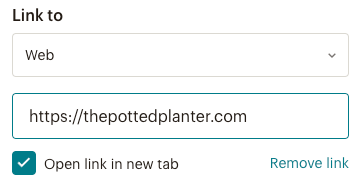
- If you want the image to link to a page or profile on the web, add a URL to the Link to field. Leave the box checked to open the link in a new tab.

- In the Alt Text field, use the suggested descriptive text or change it to make your email more accessible.

- Click the Color field to change the background color of your image block.
- In the Padding section, enter a value or use the up and down arrows to adjust the padding for each side. Check the Apply to all sides box to apply the padding equally.
- In the Rounded Corners section, enter a value or use the up and down arrows to change the size. The default value is 0, which means the corners are squared. Uncheck the Apply to all sides box and enter different values to create asymmetrical corners.
Rounded corners won't display in most Outlook desktop versions, but will display in browser versions of Outlook. - In the Border section, use the drop-down arrow to choose your border style. Your options are None, Solid, Dashed, Dotted, Double, Inset, Outset, Groove, or Ridge. Enter a value or use the up and down arrows to set your border width in pixels. Click the color circle to change the color of your border.
Enable dynamic content
You can turn any content block into dynamic content that displays different content to recipients based on conditions you set. This helps target different types of contacts at the same time with a single email.
To learn more about dynamic content and how to enable it in your content block, check out About Dynamic Content.
Technical Support

Have a question?
Paid users can log in to access email and chat support.